A peek at an early build of the new Win7 taskbar
One of Mac OS X's most successful features has been its zooming apps dock, which has been mimicked in third-party utilities for Windows. Windows 7's new taskbar looks more similar, but its changes are already themselves being changed.
The "pre-beta" edition of Windows 7 handed out at PDC 2008 last week appears on the surface to contain only a slightly revised version of the Windows Vista taskbar, if only temporarily. But developers were actually given hints that an early build of the Win7 taskbar was hidden behind a protective barrier.
Last week, Rafael Rivera, Jr., a contract developer for the Army Department who attended PDC, decided to go hunting for a way around that barrier. Essentially, that barrier only consists of code that does allow qualified accounts access to the newer taskbar. On Sunday, Rivera announced success, and posted an .EXE file that removes the barrier, allowing all Win7 pre-beta testers access to an early build, numbered 6801.
The arrangement of the taskbar changes demonstrably in Windows 7. Most noticeably, the text adorning active tasks, or the applications in which multiple active windows are running, is gone. (It might not be missed very much, because in very active systems, there wasn't much room for it anyway.) What's left are just the icons, which are made bolder. What's more, the main taskbar area can contain not only icons for running applications, but also for those you've pinned there, similar to the way you pin frequently used apps to the Start menu. So some of the icons you see in the Win7 taskbar are for running apps and some aren't; you can tell the difference by looking for the halo that adorns the running apps.

As BetaNews learned at PDC 2008, not even this reworked version of the Win7 taskbar behaves like the most recent builds that are currently being retooled by Microsoft's designers. For example, the pre-beta build still contains the Quick Launch toolbar first introduced in Windows 95; in Microsoft's internal betas, that device has been removed, possibly permanently. The pinning of icons to the main taskbar could render Quick Launch useless; it was already redundant in its co-existence with Desktop icons.
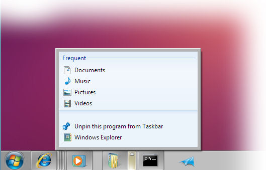
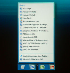
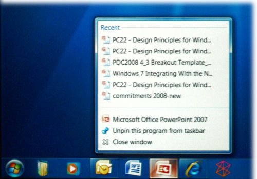
Also present in the pre-beta build but absent in current builds, PDC attendees were told, is a graphical feature Microsoft designers tried for opening up menus beside the taskbar icons. It's something they're calling the jump list, and it's a way to bring up a dynamic menu that applies to active tasks.
But did Microsoft really need the little arrow reminding folks that such a jump list exists? As the company's principal design manager for Windows 7, Steven Moreau, told attendees last week, playing with this older build made his team come to a realization.
Demonstrating the old new build seen in Build 6801, Moreau said, "What you'll notice is, there's a button hanging off of the edge of the icon...Hanging off of the right edge of it is an arrow, it's an 'other' button, something we used to refer to as split buttons -- meaning, there's a primary task and there's another one sort of sidecarring on that.
 "Now, this was perfectly acceptable, perfectly successful. You hovered over there, you saw, 'Oh, there's another thing next to Word,' and I can click on it and pull up a menu. It was successful in many regards," he continued. "In abstract, that's fine. When we brought this all together and we started utilizing it, some other little problems started coming up. One little problem that came up was, it was a little bit noisy, the experience of using your taskbar. [Suddenly] everything had an arrow on top of it. It was a little bit noisy and distracting for a function that you really only had to learn once."
In focus tests, the design team found that the thin little arrow provided a very narrow target for people's mouse pointers. There was a realization that this idea that originally appeared to be a brilliant way to condense and simplify the taskbar, could introduce some new nagging problems -- and after User Account Control, Windows didn't need another one of those.
 |
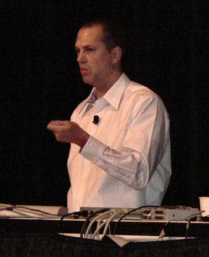
| Samuel Moreau, principal design manager for Windows 7, Microsoft. |
"Then we thought, 'What else are we going to do? It's a really important investment for us; we really want people to be successful, to understand how to use this piece of UX. So what other options could we do? Top, bottom, left, right, where else are you going to put it?"' related Moreau. "Well...what we decided to do was put it on right-click. Very interesting sort of statement there. We had the confidence to say, people will find it. Something that is very core to Windows DNA is right-click. It's very core to how Windows works. And we're taking the discoverability hit for lessening distractions, over the course of using your PC, every day, all day. So you can thank us for not having arrows a year into this experience."

The first official public beta of Windows 7 may yet contain this revised version of the jump list, without the arrow. There's a possibility that Microsoft may have decided to mask this old version in Build 6801 distributed at PDC because it was already effectively deprecated in testing.
Just getting Build 6801 to run in a Virtual PC VM was a slow process for us, and creating new Vista- or XP-based VMs typically isn't that slow. But it's running now, and in the coming days, we'll let you know what we find -- keeping in mind that some of the new stuff we uncover may already be old.
